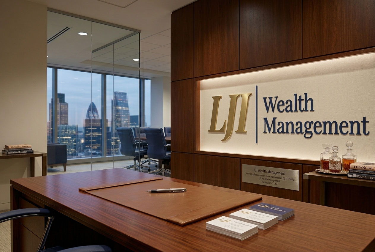

Brand Guidelines
The standards that keep the LJI identity consistent, considered, and recognizable across every application.
A consistent identity is a trusted one.
This document sets out how the LJI mark, colors, and typography work together. Following it keeps every touchpoint recognizably LJI, from a business card to a building.

Wealth, protected and passed on.
LJI Wealth Management advises individuals and families on financial planning, mortgages, and insurance. The work is long-term by nature, and the brand should sound that way: measured, plainspoken, and personal.
Everything in this document serves that idea. The mark is quiet and confident. The palette is restrained. The typography is classical without being ornamental.
Clear guidance for the decisions that shape a family's future — delivered with patience, and without jargon.

The primary mark.
The horizontal lockup is the default. Use it wherever the format allows. It pairs the italic gold monogram with the navy wordmark, separated by a single hairline rule.


Use the stacked lockup in square or narrow formats — social profiles, signage, and vertical layouts where the horizontal mark would be forced too small.
Four approved treatments.
Always choose the version with the strongest contrast against its background. Do not recolor the logo outside this set.





Give the mark a considered position.
Anchor the logo to a corner or the optical center of a layout. Keep it clear of edges, text, and busy areas of photography. When the logo sits on an image, place it over a calm, even area and use the white or gold-and-white version.


Protect the mark with space.
Clear space is measured in x — the cap height of the letter L in the monogram. Keep a minimum of 1x on all four sides free of type, imagery, rules, and page edges.
1x
1x
1x
1x
Below these sizes the wordmark loses legibility. Use the monogram instead of shrinking the full lockup.
What not to do.
The logo is supplied as finished artwork. Use it as provided — never rebuild, restyle, or add effects to it.
Two colors with conviction.
Heritage Navy carries authority; Antique Gold carries warmth. Navy leads — it should dominate any layout, with gold reserved for the monogram, rules, and small accents. Neutrals carry everything else.

RGB 28 · 59 · 111
CMYK 92 · 74 · 20 · 6
PMS 654 C
RGB 175 · 152 · 109
CMYK 30 · 35 · 65 · 4
PMS 4515 C
A serif with character, a sans with discipline.

abcdefghijklmnopqrstuvwxyz
0123456789 & ? ! $ % ( )
abcdefghijklmnopqrstuvwxyz
0123456789 & ? ! $ % ( )
The system, applied.
Stationery leads with navy and reserves gold for the monogram. Contact details are set in Libre Franklin at small sizes; names and titles keep the serif voice.
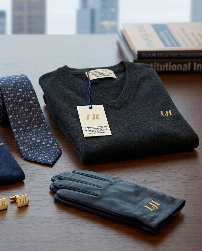
Real people, natural light.
Photography should feel observed rather than staged; advisors with clients, hands and documents, considered interiors. Warm neutral tones sit naturally beside the gold; avoid cool blue-grey casts, heavy filters, and generic stock imagery of non-LJI team members.
Warm neutral palette
Candid moments
Generous negative space
Cool blue casts
Posed handshakes
Busy compositions


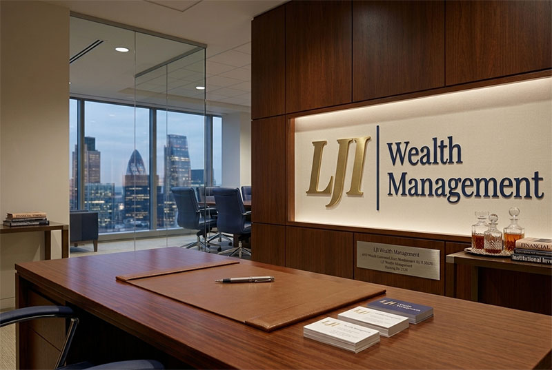

Consistency is the whole point.
Applied consistently, these standards compound. Every letter, card, and page reinforces the same impression; a firm that is careful with details, and therefore careful with everything else.